
Bonjour fashion lovers,
It’s Monday, and I want to begin the week with pure style — by returning to “Camel’s Back,” the story you can revisit here
If the 1989 editorial was a cinematic love letter to camel tones, today we move forward to 1992, where the same name becomes a softer, warmer interpretation.
Two eras. Two moods. One neutral that never loses its magic.
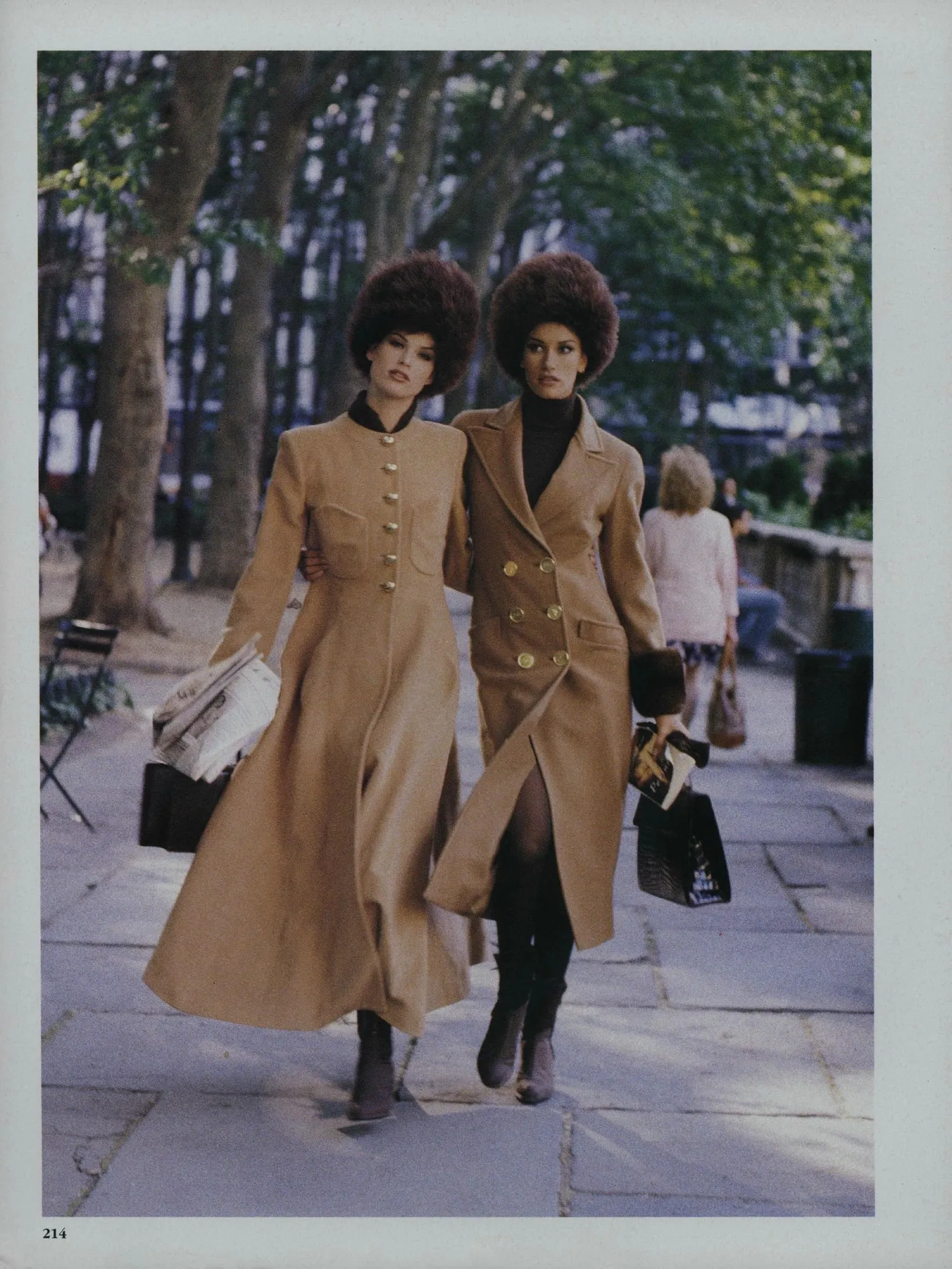
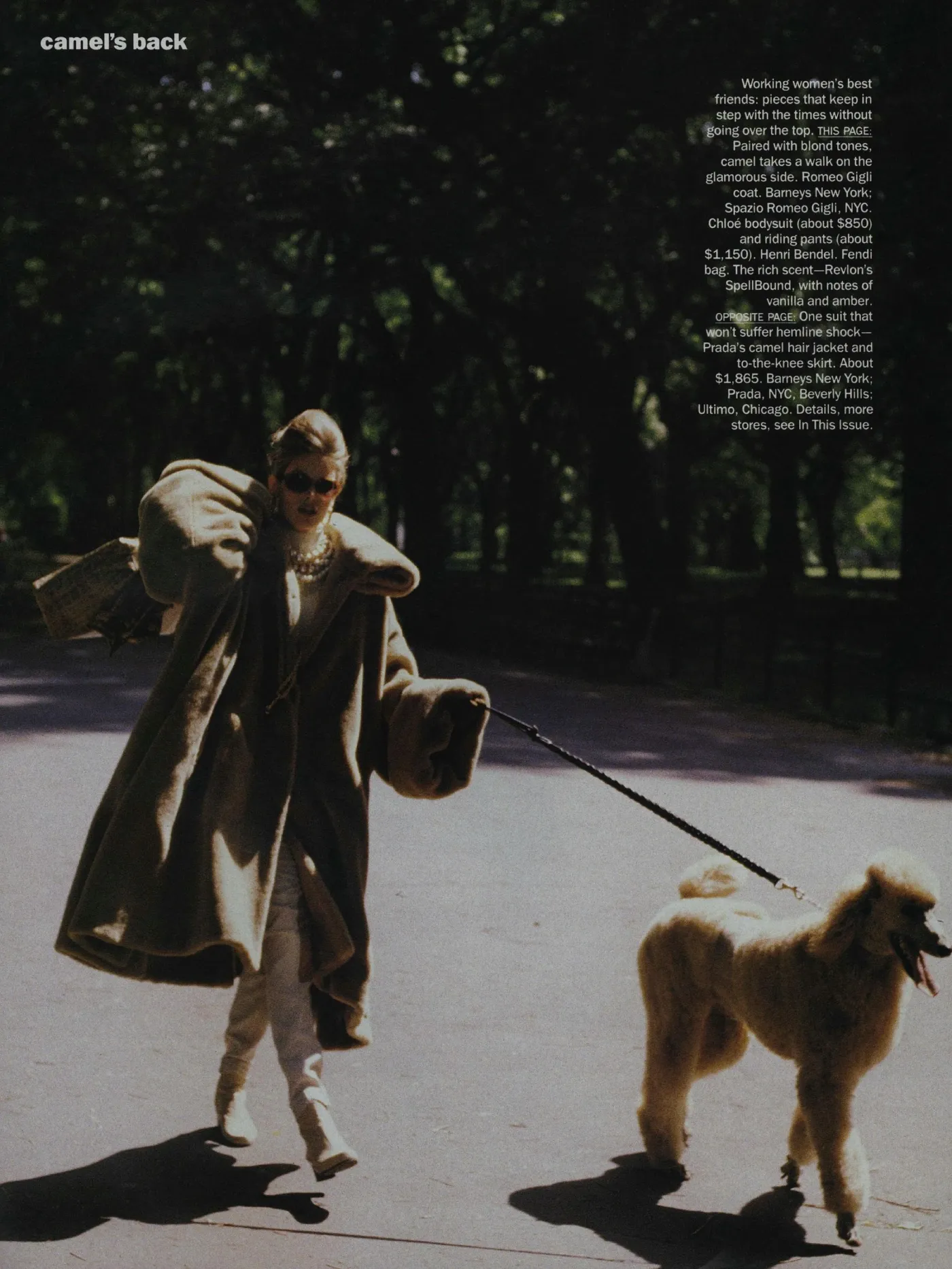
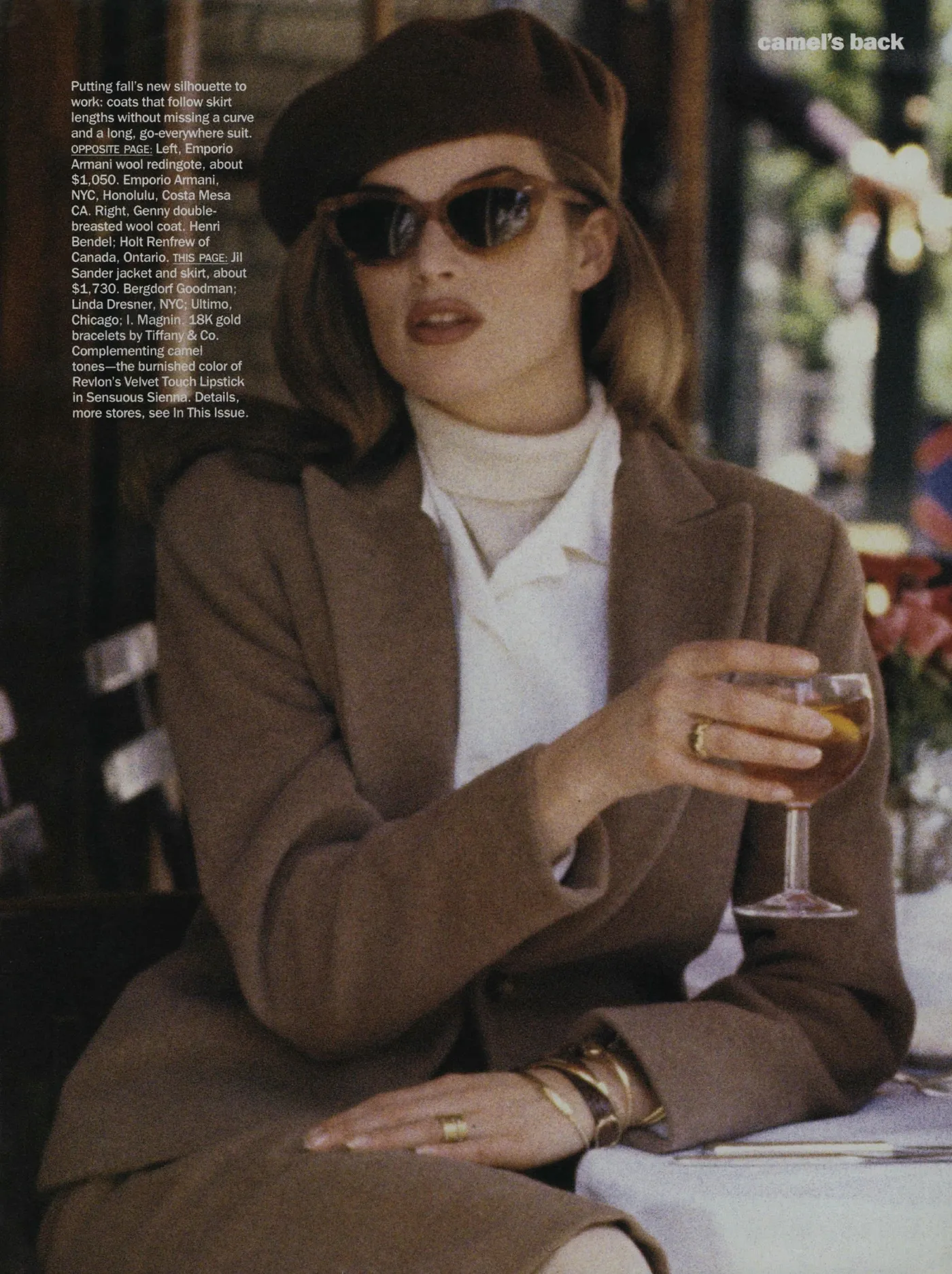
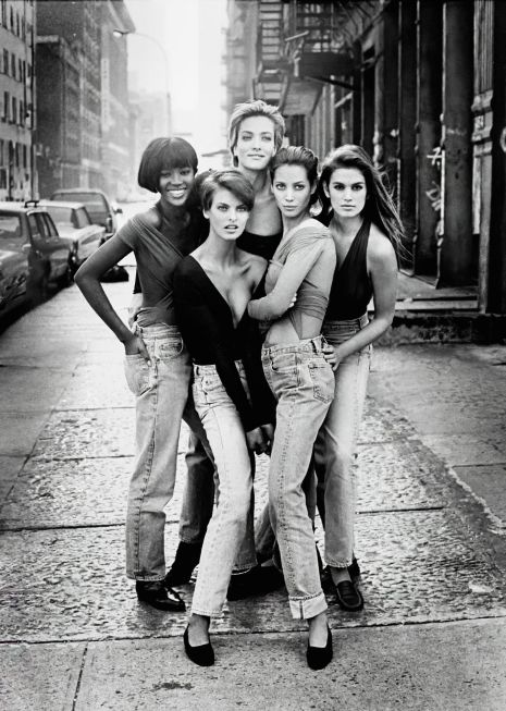
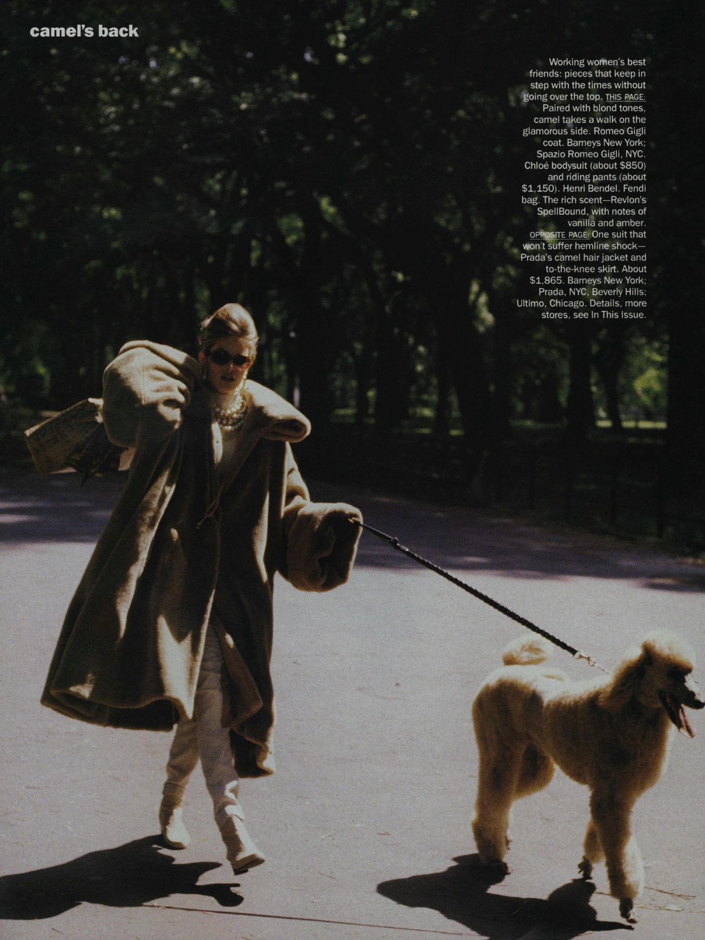
1989 — Peter Lindbergh’s Camel’s Back
Linda Evangelista, the definition of modern beauty
The 1989 version of Camel’s Back, photographed by Peter Lindbergh and styled by Carlyne Cerf de Dudzeele, is one of the most refined examples of late-80s editorial storytelling.
This was an era when the supermodels didn’t just wear clothes — they embodied worlds.
Linda Evangelista, with her short hair, sculptural poses, and unmistakable attitude, transformed camel into something cinematic, urban, and irresistibly chic.
Lindbergh’s New York is sharp, cold, and blue-toned.
Camel becomes a contrast: warm, structured, architectural.
The coats are statement pieces, the knitwear oversized, the furs grand.
The photographs feel like frames of a movie.
The mood?
Power dressing meets European elegance.
Camel becomes modern, bold, almost architectural.
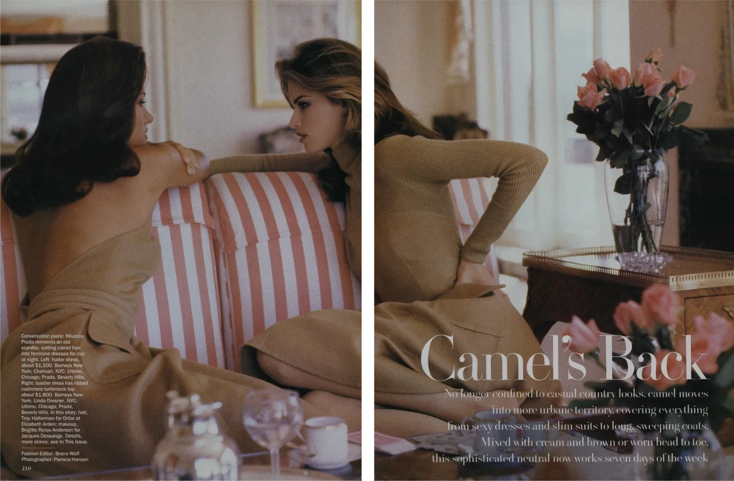
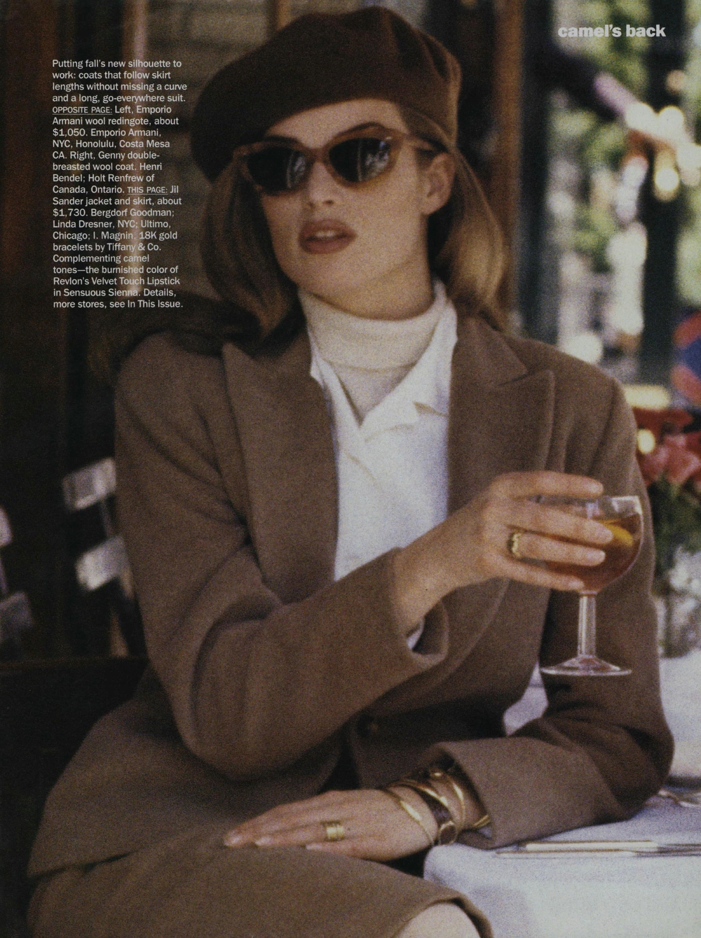
1992 — Pamela Hanson’s Camel’s Back
Meghan Douglas and Susan Holmes in a softer world
Three years later, Vogue US revisits Camel’s Back in a completely different light.
Pamela Hanson photographs Meghan Douglas and Susan Holmes in an editorial that feels intimate, sun-lit, and quietly romantic.
Where Lindbergh was sharp, Hanson is soft.
Where the 1989 camel was sculptural, the 1992 camel is fluid.
Lindbergh’s New York is cinematic; Hanson’s is warm and lived-in.
Here:
• camel blends into creamy, gentle tones• silhouettes become relaxed and feminine
• the mood is nostalgic, tender, elegant
• the narrative feels like a long walk through a softer, quieter New York
It’s early-90s minimalism at its most emotional.
Two Camel Worlds, One Timeless Color
Camel is a neutral with endless possibilities — a color that can be as fierce or as fragile as the gaze that interprets it.
1989 is strength, sharp lines, and modern beauty.
1992 is softness, warmth, and effortless elegance.
Two interpretations, one palette, infinite life.
Why These Editorials Matter
Because they remind us that fashion is storytelling.
That neutrals can be revolutionary.
That beauty shifts with the mood of a decade.
And that a great editorial isn’t just about clothes — it’s about atmosphere, emotion, identity.
My Conclusion
When I look at these two Camel’s Back stories — 1989 and 1992 — I’m reminded of why I fell in love with fashion in the first place.
Because it changes, evolves, transforms… yet remains capable of speaking a universal, timeless language.
Camel, in these editorials, is not just a color.
It’s a mood. A story. A way of being.
And perhaps this is why we return to the archives:
to remember that elegance has many faces, many eras, many shades — but it never truly goes out of style.
Always fashion, always black, always Paris.
Emanuela
